

Marble has always been synonymous with luxury and exclusivity. Today, thanks to state-of-the-art large-format marble-effect slabs, we can bring that opulence to any space without the drawbacks of natural stone. The key to maximising its visual impact lies in the combination: and what better partner than the luminosity of light tones?
Below, we explore how to integrate these stunning pieces into your interior design to create spacious, sophisticated and timeless spaces.
The advantage of large format in light colours
The use of large-format tiles from Ascale drastically reduces joints, creating a sense of continuity and fluidity. When marble designs with white, cream or very light grey backgrounds are chosen, such as Lucca Gold, Taj Mahal or Armani Silver, a key effect is enhanced: luminosity.
Why is lighting crucial in interior design?
Natural light is the most valuable asset in any project. Light-coloured materials reflect light, making rooms appear visibly larger, more open and welcoming. Combining this with the marble effect creates a perfect balance between striking veining and an ethereal base.
Design tip!
If you would like to learn more about the advantages and maintenance of this material, please refer to our maintenance guide.
Key colour palettes for the perfect combination
The versatility of large-format marble-effect tiles in light colours allows you to experiment with different colour palettes, while always maintaining an air of sophistication.
Total white: Monochromatic luxury
This is the cleanest and safest option. It consists of using the white palette as the main base for furniture, textiles, and walls. Contrast is provided by subtle variations in texture:
- Walls: Matt or textured white paint.
- Worktops and cladding: Your marble-effect slabs, for example, a design with very subtle grey or gold veins, such as Ducal Gold or Vagli Gold.
- Decorative elements: Polished chrome or glass details.
The result is an interior design of utmost purity, where the marble veins become the true work of art.
Warm and welcoming neutrals
For those seeking a warmer atmosphere without losing sophistication, combining neutral tones such as greige, beige or natural wood is ideal.
- Contrast: Use light-coloured wood for floors or furniture. The warmth of wood complements the subtle coolness of porcelain tiles and softens the atmosphere, creating a luxurious home feel.
- Textiles: Cushions and rugs in linen or wool in light earth tones.
Pastel accents and soft colours
If the project requires a touch of colour without being garish, incorporate accessories or occasional furniture in pastel shades (soft mint, pale pink or sky blue).
- In the Kitchen: Bar stools or chairs in a delicate pastel colour.
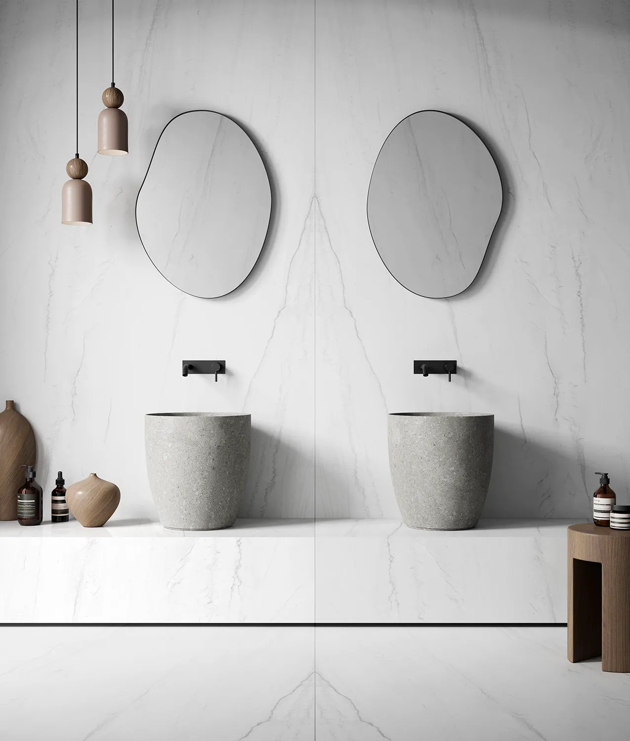
- In the bathroom: Towels and accessories that break up the uniformity of the light marble cladding.
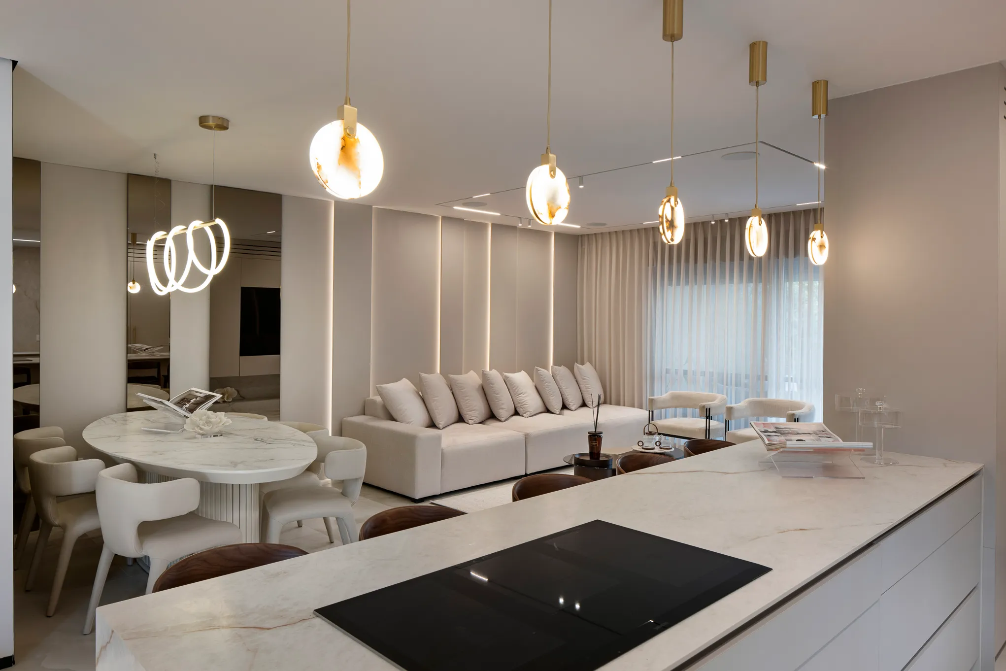
Application in real projects
We have seen how large-format tiles become central elements in every room.
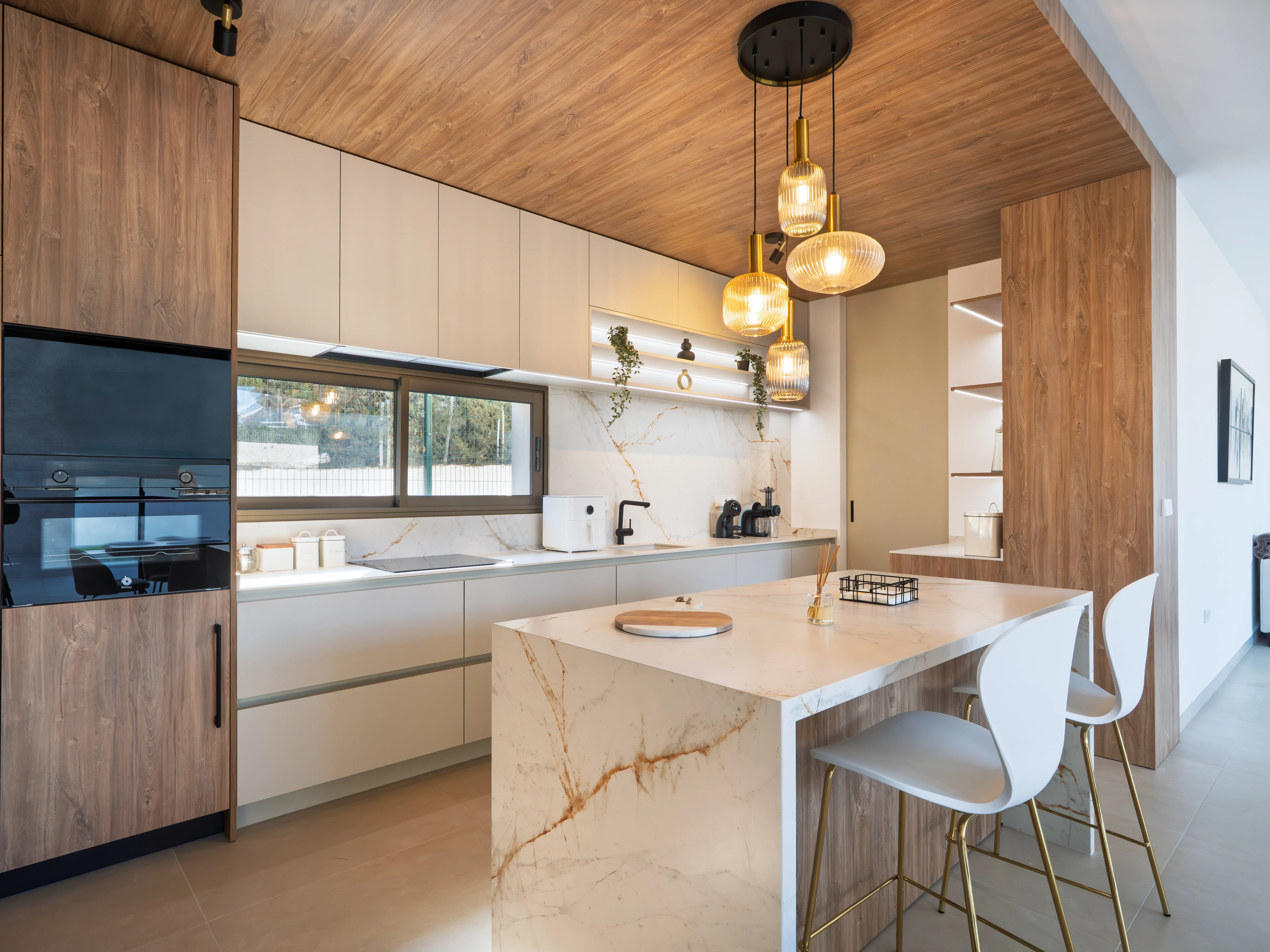
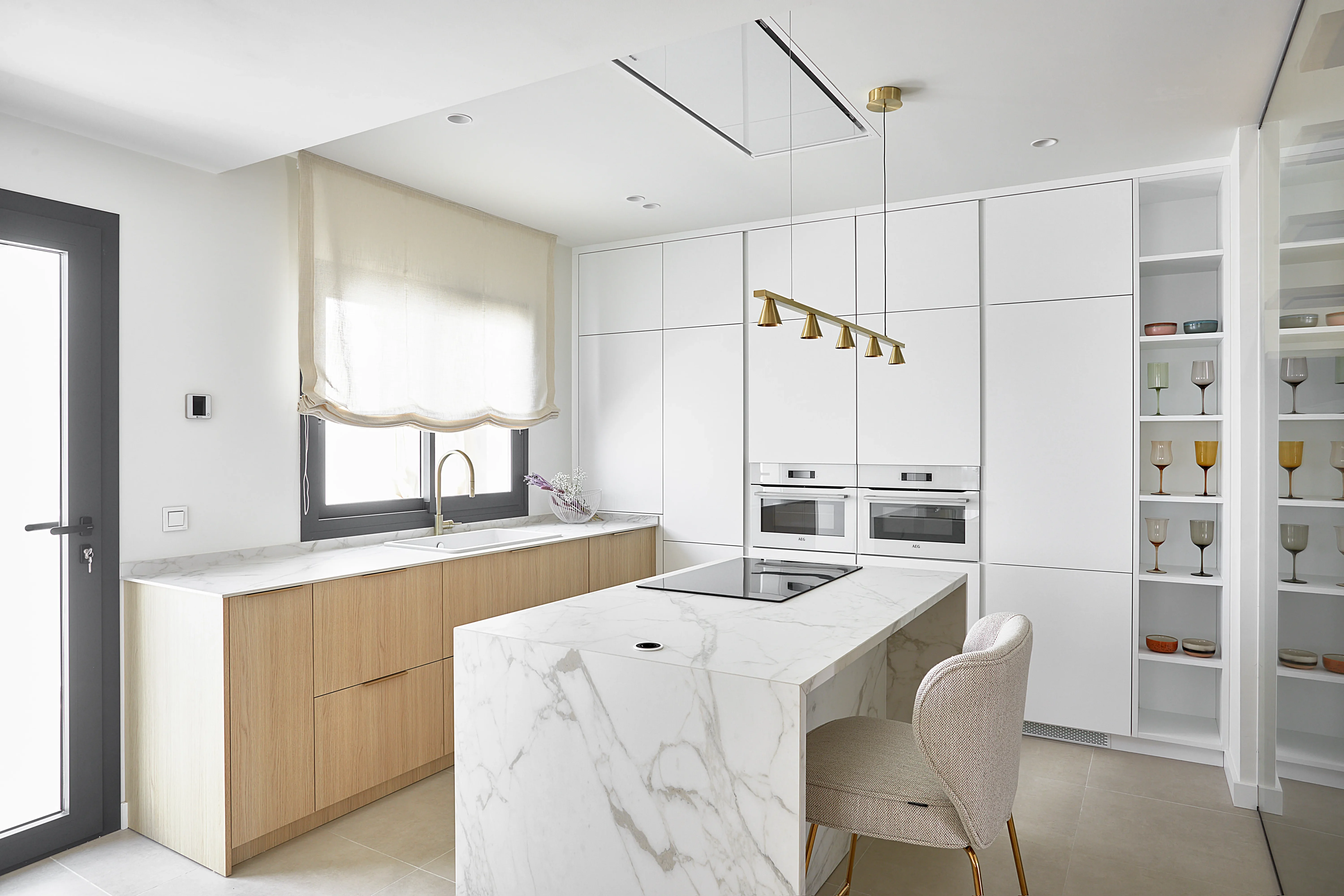
Kitchens and bathrooms: The durability of worktops
Worktops are the heart of the kitchen. Large-format marble-effect worktops are ideal here due to their durability and beauty. In our projects, we have found that combining a white marble worktop with taupe or pearl grey cabinets instantly elevates the design, providing a functional workspace and impeccable décor.
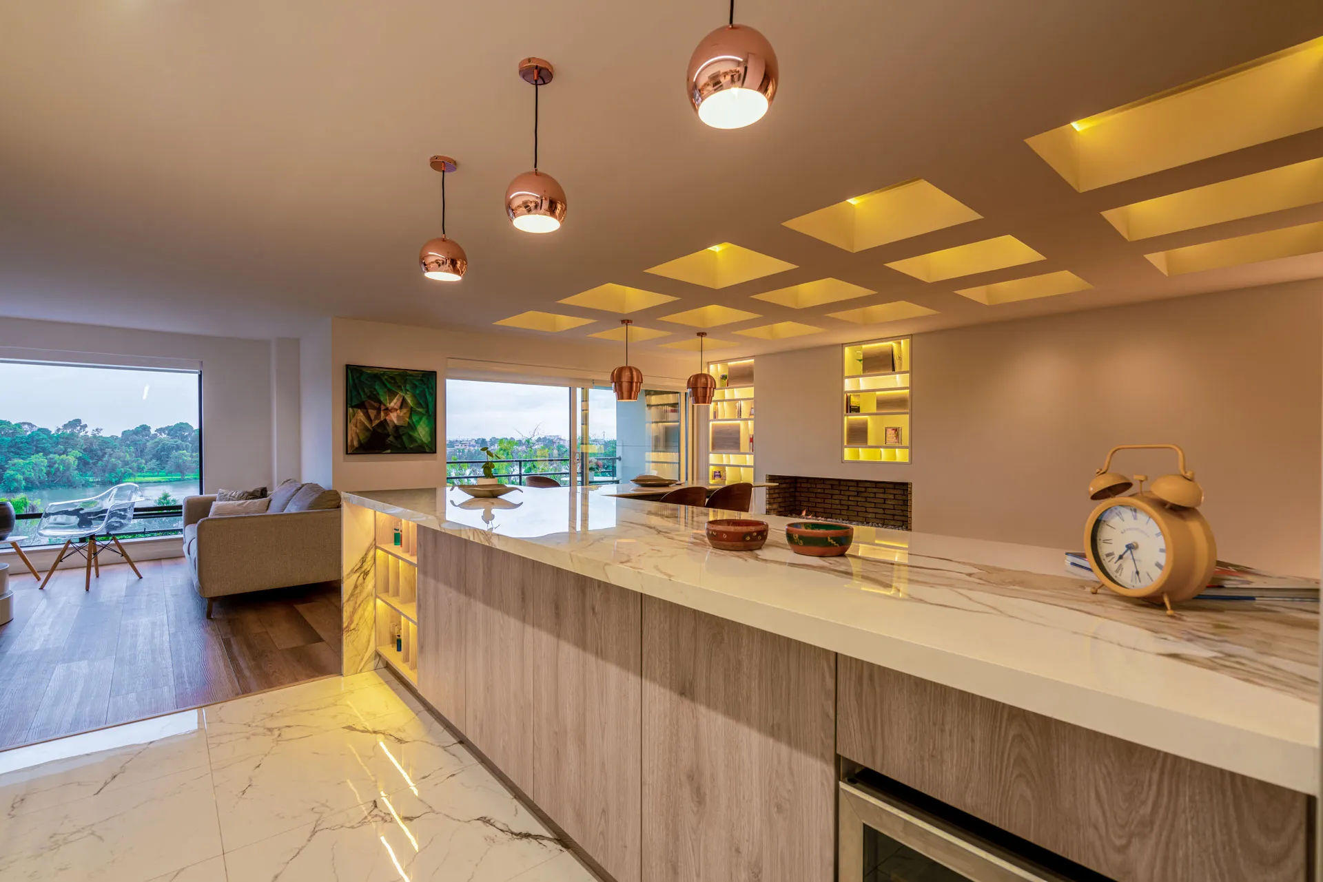
Commercial spaces and showrooms: Wall coverings
In commercial lounges or lobbies, large formats are used as the main wall covering. By using a light marble tone, we ensure that the space does not feel heavy, but rather offers a majestic and timeless accent wall. This technique works especially well in large spaces with high ceilings.
Integrating large-format marble-effect tiles in light tones is not just a trend; it is an interior design strategy that guarantees elegant, bright and visually expansive environments.
We invite you to view our gallery of recent projects where this combination is used to find the inspiration you need.
To learn about the latest trends in luxury materials and global design, you can visit specialised publications such as Architectural Digest.
